
Termoli.
A city shaped by the Adriatic Sea.
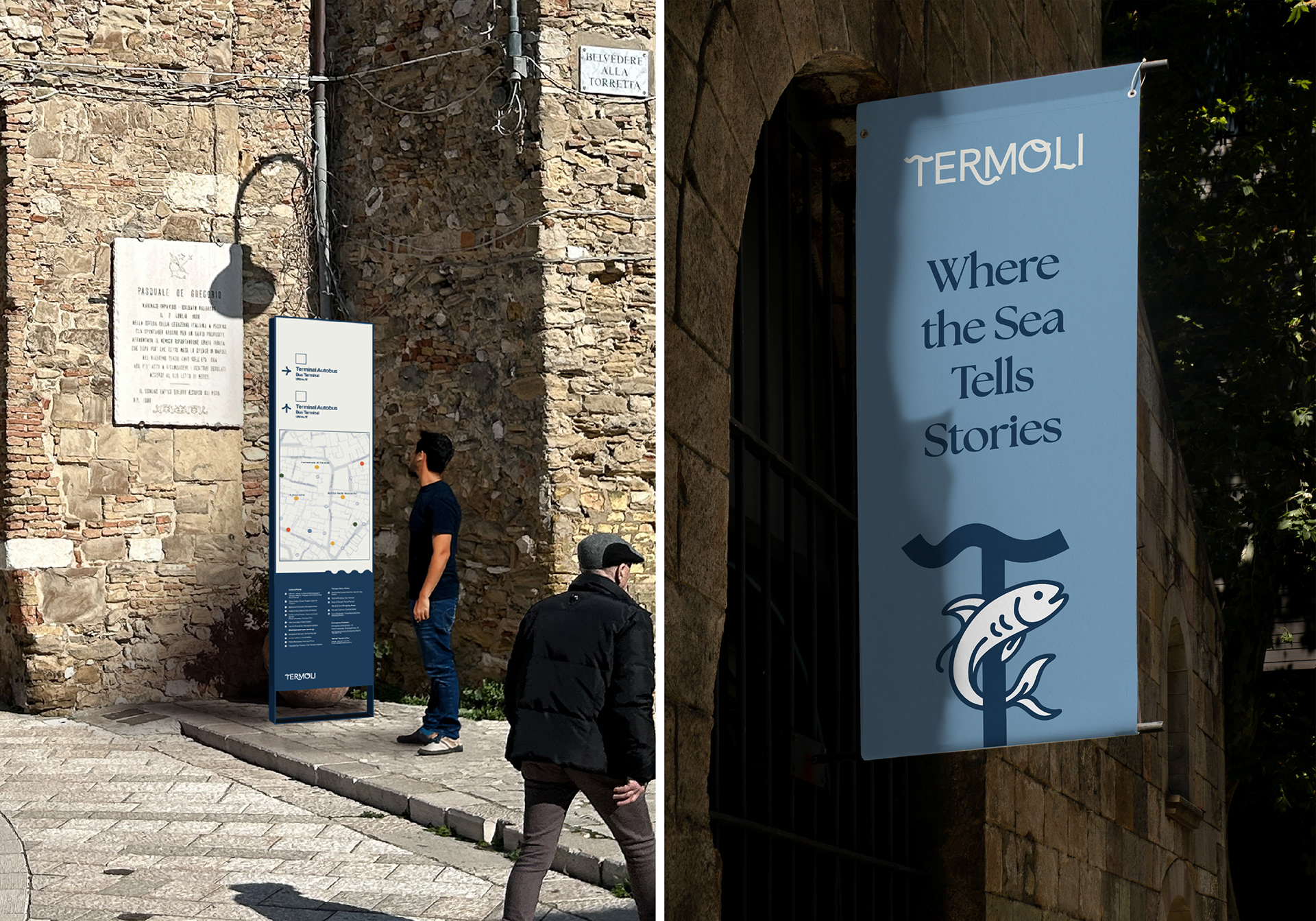
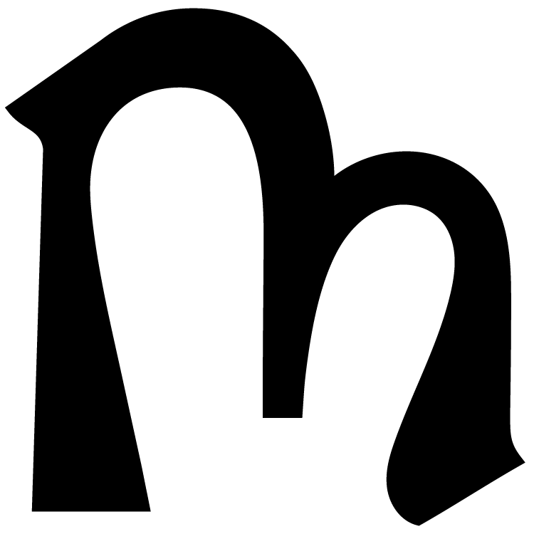
The salty breeze carried by the Adriatic touches every detail of the city — from its architecture to its cuisine, from the curves of its streets to the rhythm of its people. This identity project aims to tell the story of a city born of the sea, with a visual language that remains faithful to the past while opening boldly to the future. The logotype is crafted with custom-designed letterforms, echoing the textures, forms, and flow of Termoli’s historic and natural landscape — making the identity truly unique.


Wordmark + Tagline System
Narrative-Driven Wordmarks
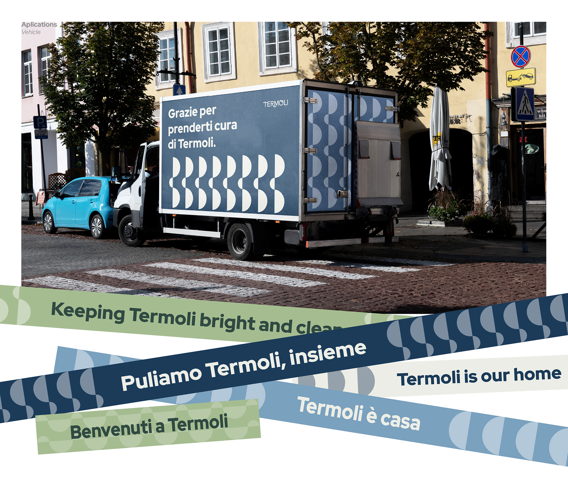
The visual identity and verbal language of Termoli work together to reflect the city’s multifaceted character. A consistent typographic structure is paired with thematic taglines, each expressing a distinct aspect of Termoli — from its seafaring heritage to its culinary richness and natural tranquility. These logo variations form a flexible brand expression system that adapts to different contexts, seasons, and audiences, while remaining true to the spirit of the city.

A Graphic System
That Embodies Termoli’s Identity
The wave-like forms in the logo were originally drawn by hand to reflect the spirit of Termoli. Carefree, spontaneous yet harmonious, these shapes create a visual rhythm alongside the letterforms. Just like the sea constantly reshaping the shoreline, these graphic elements flow naturally across printed and digital media. To enable consistent application across different formats, the freeform waves were translated into a more geometric and modular graphic system. This approach maintains a sense of visual lightness while helping to organize information effectively. This system offers two main advantages: – Once established, it can be easily implemented by different teams. – Its modular nature allows it to adapt seamlessly to a variety of contexts.